NOCCCD Logos
The North Orange County Community College District logo is the cornerstone of our brand identity, serving as the most instantly recognizable symbol of the District. It is a crucial element in all our communications, representing the essence of NOCCCD and ensuring consistent and impactful branding across various platforms.
Jump to Related FilesPrimary Logo
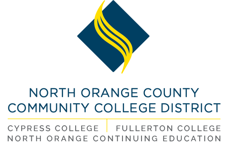
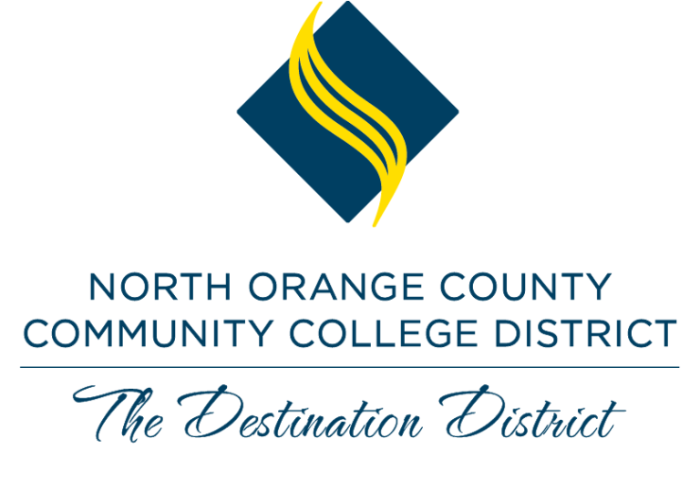
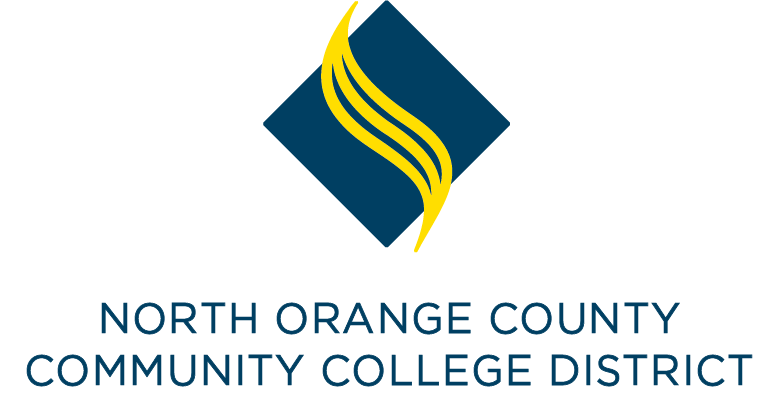
| Horizontal – The standard, official logo of NOCCCD. It features an illustrative mark with the NOCCCD name in Gothic. | |
| Stacked – When the layout calls for it, the stacked logo may be used for additional flexibility. | |

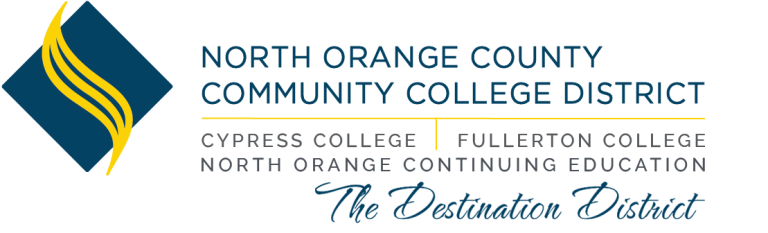
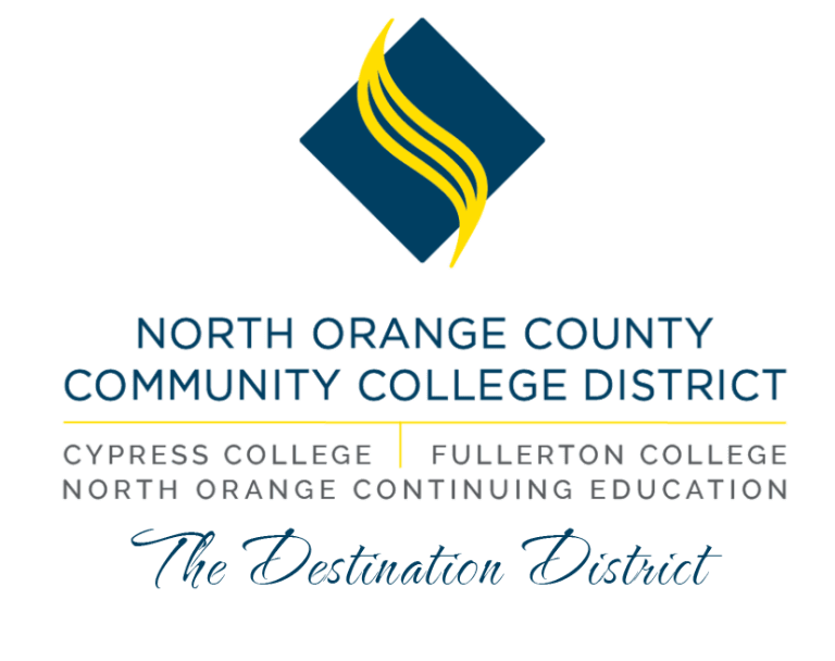
| Combined – Drawing inspiration from our original graphic mark of a mortarboard and three tassels, this logo showcases all four entities in a cohesive and layered relationship. |
Logomark
A logomark is a concise symbol representing a brand's identity and values, designed for instant recognition. It's ideal for small spaces or when the brand name is already prominently displayed elsewhere on the collateral. For example, it can effectively appear on social media where space is limited, while the full brand name might be used on more expansive materials like letterheads or websites. This strategic use ensures consistent brand visibility and recognition without redundancy.
Variations and Usage Information
The logos can appear in one-color blue, black or white depending on design. Use the reverse logos for applications on color or photographic backgrounds. Always ensure that the background you choose provides sufficient contrast for the logo to be clearly visible.
Black Variation
| Horizontal logo in Black | |
| Stacked logo in Black | |
| Logomark in Black |
Blue Variation

| Horizontal log in Blue |
| Stacked logo in Blue |

| Logomark in Blue |
White Variation
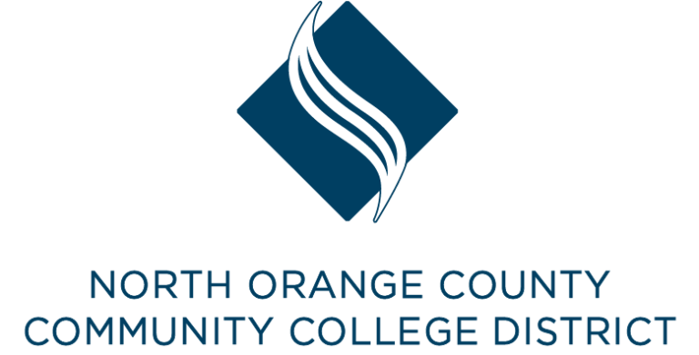
| Horizontal logo in White | |
| Stacked logo in White |
| Logomark in White |
About Taglines
A tagline is brand identity in a nutshell. It is a short set of words that can be easily remembered by an audience and helps them understand what our brand stands for. Taglines can change over time.
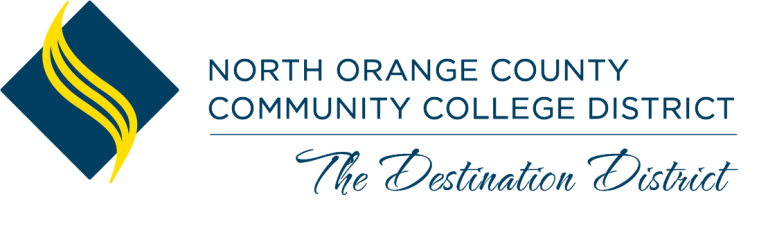
In 2024, NOCCCD introduced "The Destination District" as its new tagline.
Why "The Destination District"?
This tagline captures our District's unique position as the go-to place for students, employees, community members and workforce partners. We are "the destination" for:
- Award-winning, accessible education
- Passionate people who want to grow, learn and serve
- Community and workforce partners who want to build connections with our faculty, staff, administrators and students.
"The Destination District" sums up the important role that we play in the lives of the people in North Orange County.
Using the Tagline
When using the tagline, please keep the following in mind:
- Please use the hashtag #TheDestinationDistrict on all social media posts
- The tagline is not required on all materials, but departments are encouraged to incorporate it in District-wide communications.
- If the tagline is incorporated into design materials, consider using the provided graphic lockups to maximize brand and design consistency.
- Do not make any modest edits to the tagline. The font and casing standards have been established by the NOCCCD Graphic Design department. Any minor modifications to the tagline weaken its impact.
Logo Lockups
| Horizontal Lockup |
| Stacked Lockup |
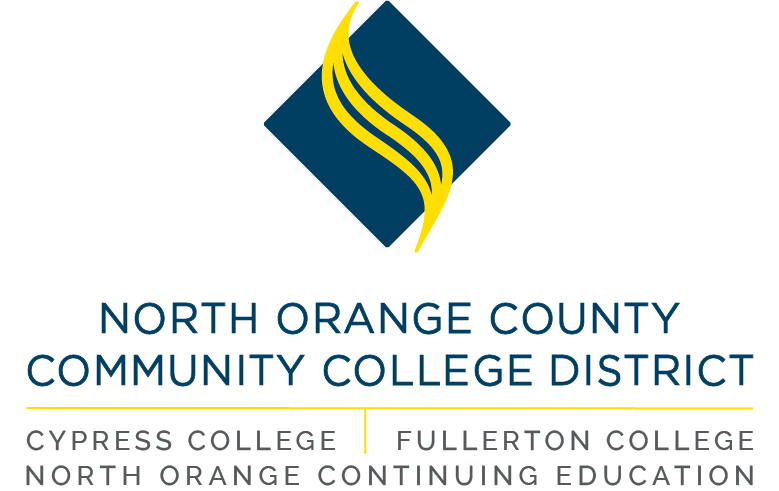
| Combined Logo Lockups |
All logos should be sized appropriately for each particular purpose. Common sense should prevail. Do not stretch, shorten or warp the logo to fit in any circumstance. If you are having trouble sizing the logo to fit your purpose, please contact the Graphic Design department for a solution.
Incorrect Usage
Consistency of the logo is necessary to maintain the District's identity. Please be mindful of the following restrictions when using the District logo.
- Do not alter the colors or used unapproved colors in the logo.
- Do not change the logo to outlines.
- Do not separate the elements of the logo.
- Do not warp, skew, or stretch the logo proportions in any way.
- Do not tilt the logo.
- Do not screen or shade the full-color logo.
- Do not apply drop shadows or special effects to the logo.
- Do not re-create the logo in any way.
Usage Against Busy Backgrounds
The reversed logo may also be used on photographs or busy backgrounds, especially those with a dark or uneven light background. A rectangular block behind the logo using the NOCCCD primary palette colors can be used.
Shown here is the minimal amount of clear space that should be allowed around the logo to ensure its visibility across all deliverables. Clear space is defined as a lack of type, photography, graphics or any other visual elements.
This amount of clear space should be used only when a very small amount of space is available. In all other events, allowing clearer space is highly recommended.
Minimum Logo Sizes
Note: Not to scale


Minimum Clear Space
No objects or text should be within a minimum of .25" clear space around the logo.